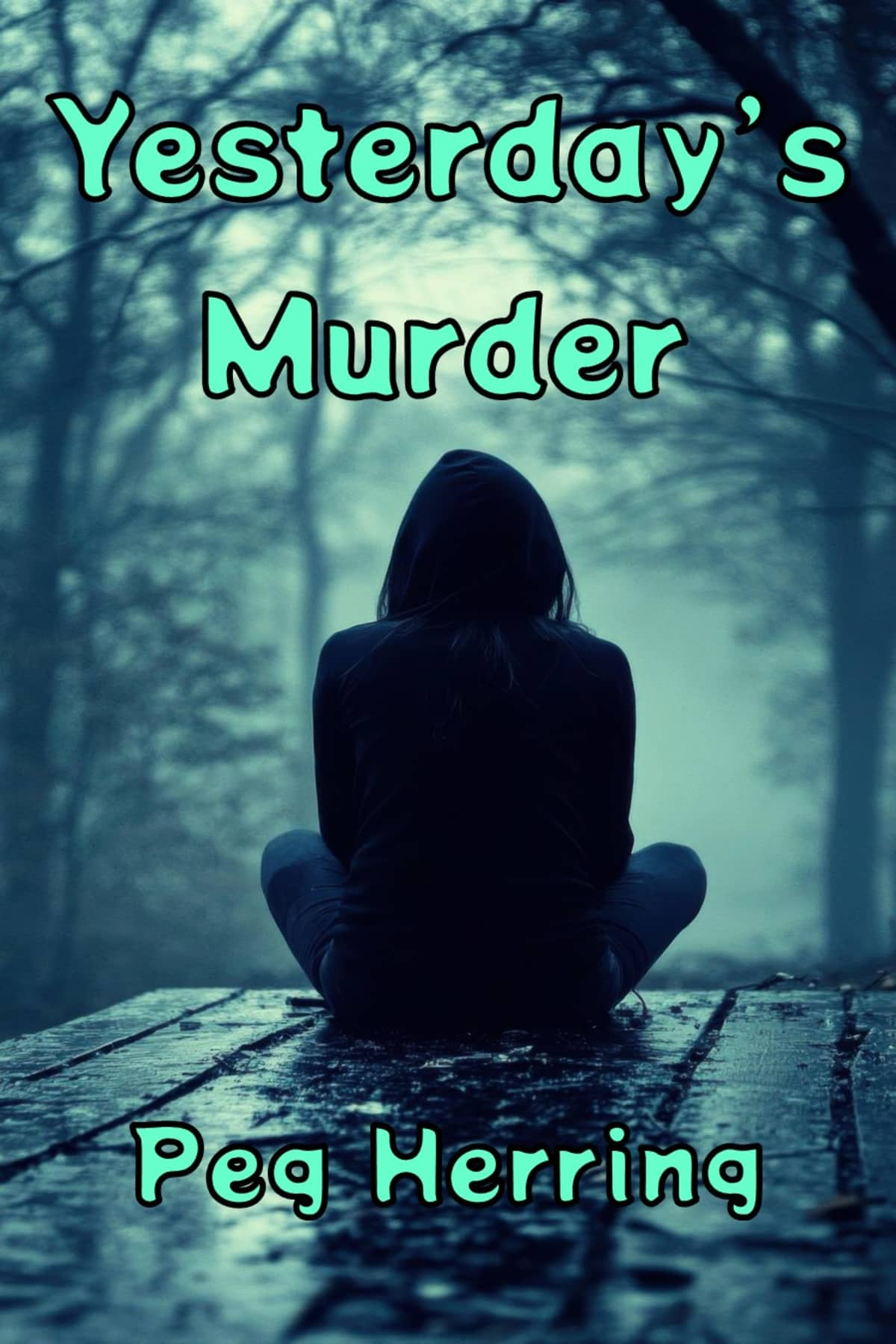
I love the mood set by this cover photo. The problem arises when it's reduced in size, because the lettering melts into unreadable blobs. We're experimenting with new fonts and colors, so it might end up with all black or all white lettering, or the artist who helps me with covers might find a font that shows up better.
Covers are weird in that they speak to some and not to others. Are we subconsciously looking for a certain vibe, so that our eyes stop at the book on the shelf at the store that promises to fit? Experts say that color has something to do with it. Mysteries are expected to appear clothed in dark colors. That doesn't hold true for cozy mysteries, and I've even seen noir mysteries that have vibrant, eye-catching images, so it's all kind of a guessing game. (Here's an article about choosing cover colors if you're interested: https://www.qinprinting.com/blog/what-is-the-most-attractive-color-for-a-book-cover/)
The image presented should match the mood of the story, and when I saw the photo here, I thought, "That's it." My main character wakes from a coma to learn that her husband is dead, so the picture's mood of loneliness and sadness struck the right note. The story centers on the woman, Tonnie, so the single, lone image works well for that too.
The book is slated for mid-summer release. I should have the font figured out by then, so you'll be able to read it in those thumbnail images online as well as on the shelf in a bookstore.
